
Everybody has them: that image that is as near perfectly exposed as you can get, the composition is good and when you made the image what you saw spoke to you at some level.
But...
When you pull it into your RAW processor of choice no matter what you do it lies there like a gopher on a prairie highway: flat and dead. You feel like you're staring into a washed out desert at high noon and no amount of finangling can fix this turd of an image. In your gut, however, you know that this image has merit and shouldn't be given up on.
I was out visiting my mother and sister in the Comox Valley a while back and is usual it was raining. In all the years she's lived there -- about 20 plus -- I can count the times that I've actually had a sunny day. It's been rain, snow, wind, rain, cloud, and all the possible combinations: sometimes within a few hours. This visit was no exception. I was lucky this time: the rain wasn't blowing sideways.
We had headed down to Coombs to hit the Dutch Store for some essentials. You readers who have more than a few ounces cloggy blood in you'll know what that means. We'd taken the old Island Highway down and on the way back we decided to stop at Qualicum Beach to have a cup of coffee. Sitting on the promenade I made the following image. The sky was clearing and the Coast Range across the Strait was getting seriously rained on. The shimmering water, the Rembrandt sky. Yeah, so I got this instead:
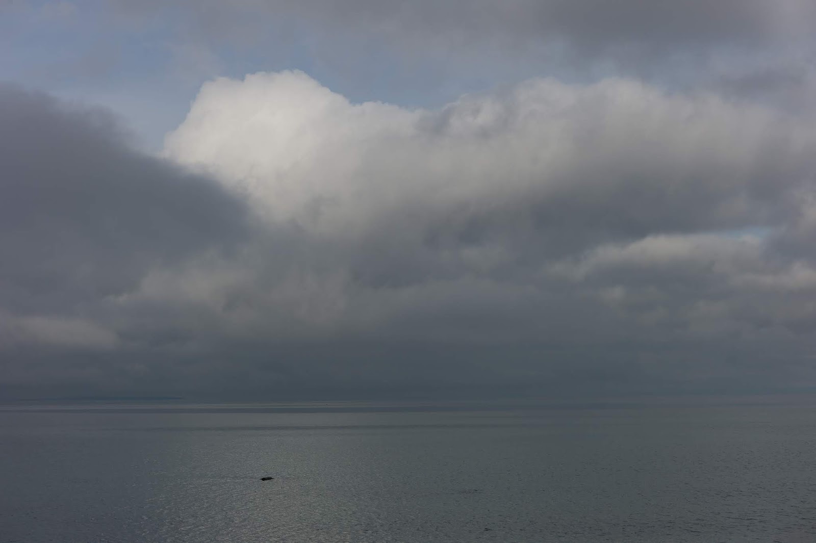 |
| Straight Outta RAWton |
Flatter than a dead gopher on a road, amirite? It looked okay when I chimped the black and white image. I shoot both raw and a BW jpeg. The composition works. The rain hammering down on the Coast Mountains, the shimmering water illuminated by the patch of sky and the cumulus cloud.
The composition works, yet the tonalities I saw just weren't there. I knew the image I saw through the view finder was in there. I just had to liberate it from its current digital capitivity.
Looking at the histogram, the exposure is about right. Maybe overexposed by a 1/2 to 2/3 stop but really nothing too egregious. In what follows I have to note that I use a colour balanced workflow: calibrated monitor, monitor brightness dialed back to match a glossy print und zo weiter.
 |
| Base Histogram |
Okay, so let's tweak the exposure -1/2 stop. Hmm, nope. That made the greys go to where they were supposed to but muddied the sky and cloud. That sky was a very bright blue. OK, Let's muck about with the other exposure sliders.
 |
| Slider Settings and Histogram |
 |
| Post Sliders |
It's close but still not exactly what I was looking for. As well, these settings amplify noise in the sky if you zoom in -- not really a good thing
Sooooo, let's mess with the Tone Curve. I just grabbed the default Strong Contrast curve.
 |
| Default Strong Contrast Curve |
 |
| Post Strong Contrast Curve |
Still a load of Nope. I'm clutching at straws at this point so let's mix the sliders and curves together
 |
| Sliders and Curves |
Now we're starting to cook with gas. The sky is starting to peep through as I had envisaged it, the heavy rain on the mountains is still there but now with the intensity I had desired, and the clouds showing the textures and shades that I want to show. The bottom of the image still sucks though.
Still it wasn't quite right. I really get worried when I have to yank sliders around that much. I start getting concerned about how things will appear when printed. I process in the ProPhoto colour space but that has a wide and tolerant gamut. When you go and print you really have to watch for out of gamut: this depends on the paper that you are going to print on.
In many other attempts I was drawn to the presence sliders but this image really made me think twice about these: quick and easy micro-contrast at the expense of sometimes cartoonish images and "interesting" colour shifts -- especially in this image, and noise. I tried Topaz Adjust AI, a full ON1 Raw tool chain and ON1 Effects only. None of these really did what I wanted. I may have missed something but really, the results didn't float my boat. I don't do single image HDR. That's just not done in polite company!
I let the image sit for a while. I'll do that when I'm stymied. No sense flailing about willy-nilly and going nowhere fast.
I was staring at my library the other night and my eye happened on Dan Margulis' book "Photoshop LAB Color: The Canyon Conundrum and Other Adventures in the Most Powerful Colorspace" Long out of print, Margulis takes you through LAB and shows you how to use it to make some really potent corrections quickly. He admits that there are other ways of achieving the same thing but LAB is really quick and a reasonable tool to use when faced with seemingly intractable problems like bring life to desert scenes, complex colour corrections and retouching badly damaged images. I used the latter to clean up some images of my wife's ancestors' photos made in the Ukraine pre-Holdomor. There are PDF copies of the book floating around the internet but do try to buy a legit copy if you can. Some of the scans are really crappy.
I'm not going to give a course in LAB or why these techniques work. I'm just going to work through this image to see what we get.
In the book there is an example of him using LAB space to bring a flat seascape (sound familiar?) to life. Without getting into the deep hairy details about LAB, this it what the channels in LAB mean:
 |
| Example of LAB curves |
L goes from dark to light, from 0 to 100; L is never negative (A & B can be). An L value of 0 means pure black while and 100 means pure white. An L value of 50 is equivalent to a 50% grey. L controls exposure and contrast only. In RGB, mucking with the contrast can (and usually does) muck up the colours. The a & b channels govern the relationship between the opposing colours that are part of the theory behind LAB. The values for these channels range from -127 to +127. A value of +128 means a is all magenta or b is all yellow and a value of -127 means a is all green or b is all blue. Mixing all this up you can get any colour that exists and some physically unrealizable colours as well: liquidine velvet chermerculoid yellow springs to mind.
PLEASE NOTE! The above is horribly simplified. Read Margulis' book if you want to get down and dirty with LAB, its theory and practice.
Also note that in the curves shown above and below I'm following Margulis' practice of showing them from 0 to 100% with lightness to the left as opposed to the PS default of lightness to the right. This setting is equivalent to "ink deposited" that is used when working in the CMYK space. You don't have to do this. Do what ever you want as the Chesire Cat said.
So, Hi! Ho! Hi! Ho! into Photoshop we go.
After changing into LAB mode we add a Curves adjustment layer. After a some experimentation I came up with these adjustments:
 |
| Final LAB Adjustments |
You'll notice that there are no adjustments to the a channel. The a width of the a channel histogram is so narrow that no matter what you do (unless something very, very rude to the curve) nothing happens. I also made sure that after the adjustments everything was still in gamut for the printing service that I use.
 |
| Post LAB Image |
This is what I was going for. Not to over cooked, nicely in control. This was done much quicker that all the phaffing about in LR to get a less desireable result (to my mind, at least).
So, back into LR to do just some minor tweaks. I wanted to enhance the shimmer of the reflection of the cumulus cloud so I applied a radial filter comme ca:
 |
| Radial Filter |
Then a bit of sharpening, masking out most of the blocks of relatively continuous tone et voila, the final image:
 |
| Final Colour Image |
I can now pull this into NIK Silver eFex and get the black and white image I was after. No, I'm not sharing my workflow there; that's my "secret sauce":
 |
| Final Black & White Image |
A successful session in the LAB I would say.
And now, some Bobby Pickett:
And now, some Bobby Pickett:


